I talked about the steps to clean your raw data in my last blog post, now I’d like to introduce you some easy steps to conduct simple data analysis, hypothesis tests (including t-test, ANOVA, regression), and visualization with a statistical tool, JMP.
Some of the data analysis methods can be conducted in Excel, but when it comes to a large amount of data, Excel is not capable of handling them quickly and powerfully.
If you are interested in trying JMP on your own, you can download a 30-day free trial. Also, this is a comprehensive step-by-step instruction of JMP, which is not going to cover any statistics learning materials.
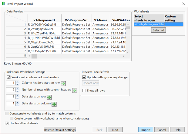
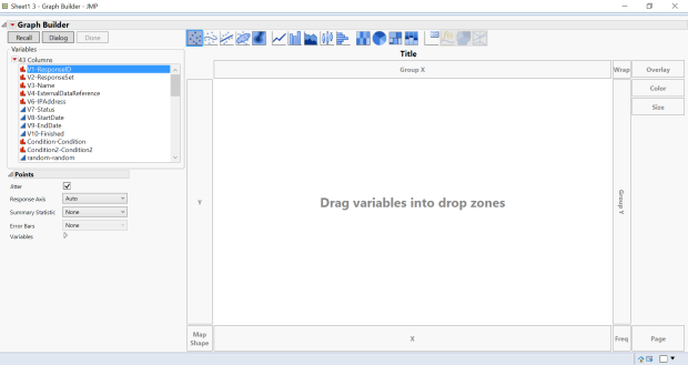
First, import your file into JMP (notice that if your column headers are more than 1, please change the number at “Individual Worksheet Settings”).
Next, some simple data analysis you can play around:
1.Distribution
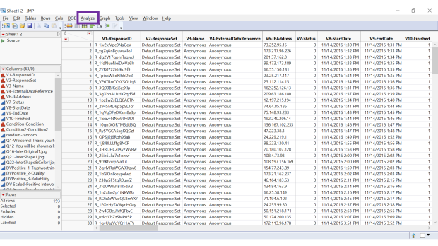
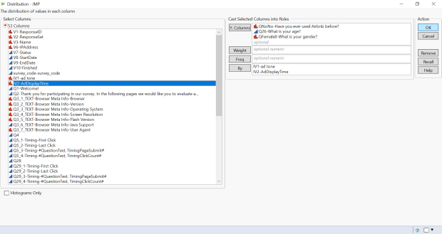
Go to the navigation bar, select Analyze > Distribution> Load the variables into Y box (e.g. gender, age, etc.) Then you can see how these variables distribute.
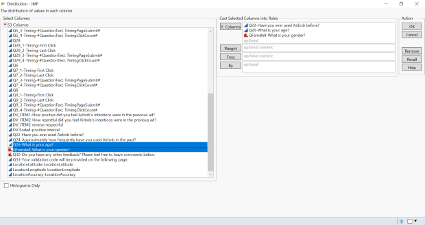
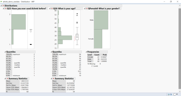
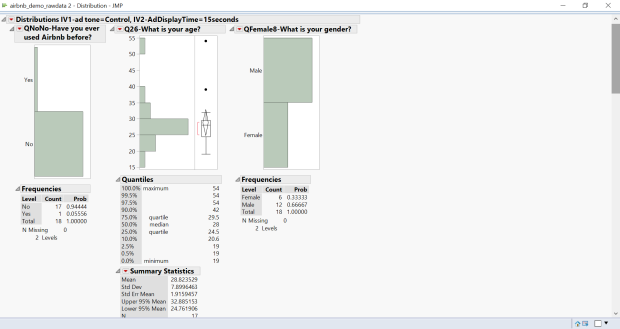
Notice that if you didn’t clean your data well, the results may be confusing. See Q22 “Have you ever used Airbnb before”, the result seems like a few participants used Airbnb 1-2 times, and a lot of them used Airbnb 2-3 times. But it doesn’t even make sense. So we can go back to the raw data and see what went wrong. It turns out the numbers actually indicate the choices from multiple choice question of the survey, 1 = Yes, 2 = No. So if you follow the step of “recode/rename data”, you will get the result below. Once you rename the data, you can see the icon on the right of the variable names, has changed from a blue triangle to a red bar chart. The blue triangle means continuous values and the red bar chart means nominal variables. You can right click on them in the JMP home dashboard to change them.
2.Filter Data
Sometimes extreme data may affect the degree of representative of result, which you don’t find in data cleaning process, so you may filter out these data.
Go to the navigation bar, select Rows > Data Filter.
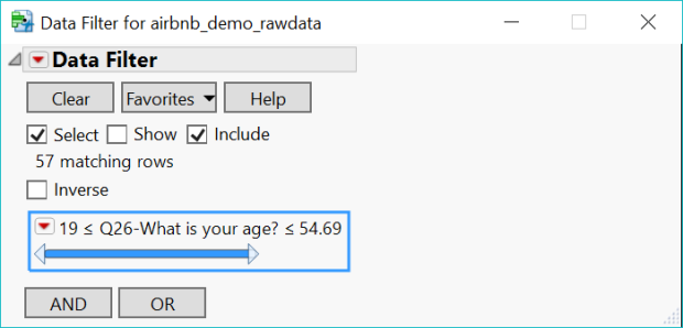
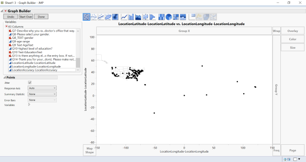
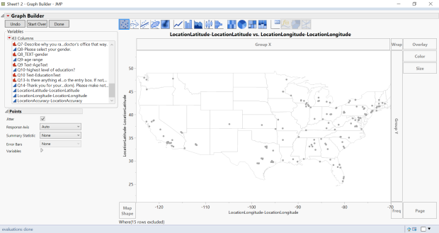
You can click on the numbers to type in formula. You can also apply this on location. For example, If you want to focus on survey results located in the US, you can filter out results outside of the US. Instead of typing in longitude and latitude manually, the easiest way would be Building a geographic map > Highlight the dots outside out the US and right click > Rows > Row Exclude. We will get into how to build geographic map later.
3.Multi-item Scale
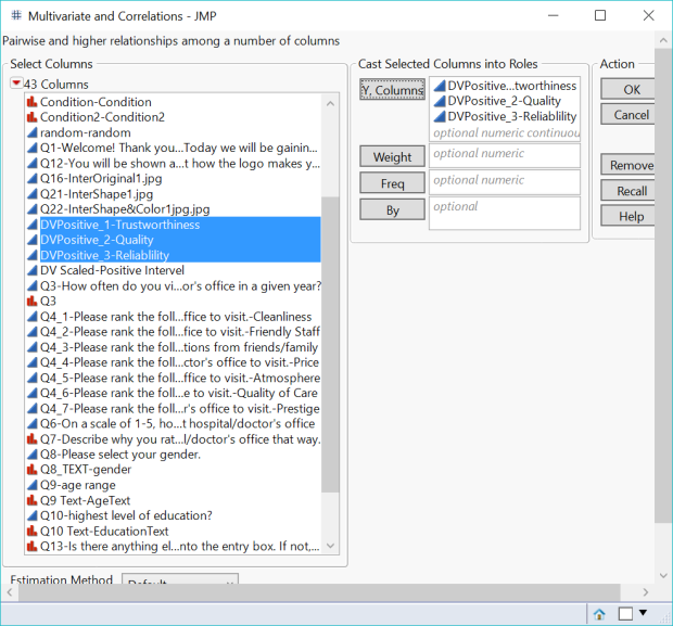
When you used multi-measurement questions in your survey, for example, when you ask how people think about a business logo regarding quality, trustworthy and reliability, or when you ask how people think about a business in both positive and negative way, you want to test if people understand these questions and the responses are reliable, multi-item scale test should be run in these cases.
Go to the navigation bar, select Analyze > Multivariate Methods > Multivariate > Load all of the multi-measurement items into Y box (load the reverse column if you have both positive and negative framed questions. In other words, load either all positive framed questions or negative framed questions)> Click the red arrow > Item Reliability > Cronbach’s alpha.
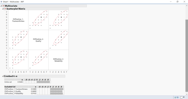
Generally, you entire set of data is reliable if Cronbach’s alpha > 0.7
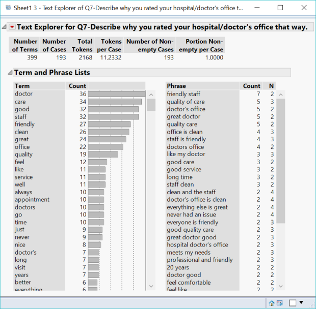
4.Word Cloud
For open-ended questions, you can create a simple wordcloud and see what keywords were mentioned the most.
Go to the navigation bar, select Analyze > Text Explorer > Load the text column into Y box > Click the red arrow > Display Options > Show Word Cloud
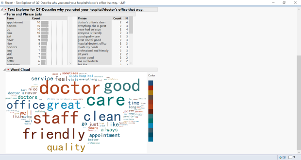
Honestly I don’t think the layout of word cloud in JMP look very good. If you want to make a better look of work cloud, I suggest you use other tools.
5.t-test
You can run a hypothesis test between two independent variables to determine how different their means are.
Go to the navigation bar, select Analyze > Fit Y by X > Load your DV into the Y box & Load your IV into the X box > Click OK > Click the red arrow > Means/Anova/Pooled t
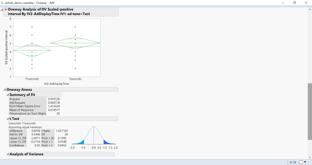
Notice that t ratio is the test statistic (t-value) and Prob > |t| is the p–value. If the p-value is in red, which must be <0.5, indicates the effect was significant.
6.ANOVA
When there are more than 2 independent variables in your data, you will need to run ANOVA test to determine if there means are significantly different. The steps are simply the same as t-test, except for the last step that you choose Means/Anova instead of Means/Anova/Pooled t (JMP automatically drops Pooled t when there are more than two variables).
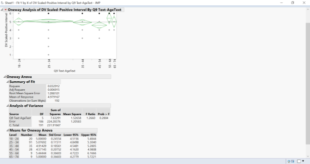
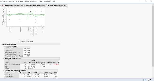
Notice that F Ratio is the test statistic and Prob > F is the p–value. If the p-value is in red, which must be <0.5, indicates the effect was significant.
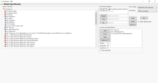
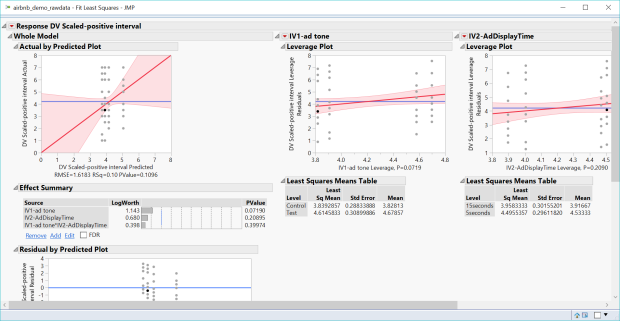
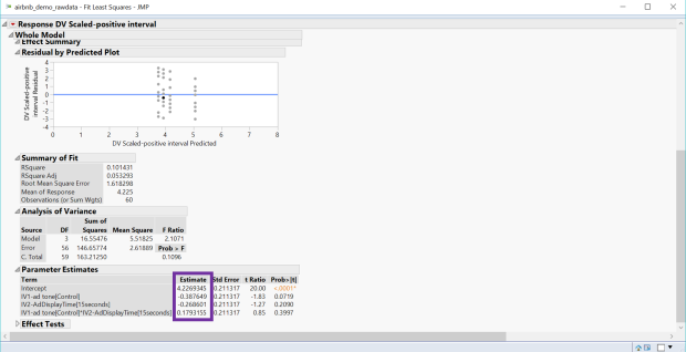
7.Regression
If you are interested in whether there’s correlation of two variables, you can run a regression.
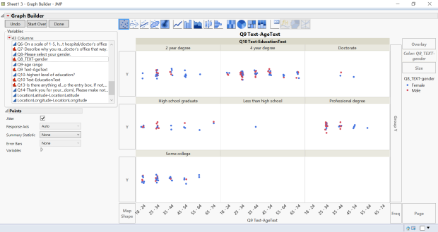
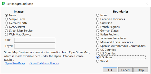
If you like to create a geographic map, you can also Load longitude in X and latitude in Y > Right Click the graph > Select Graph > Background Map > US states or world or whatever map you like, then you will get the geographic map I mentioned earlier.
Bubble Plot
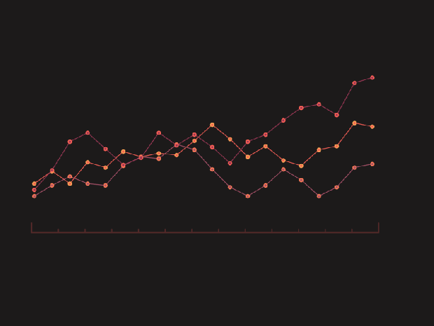
The Economist love using bubble plots a lot. It is very useful, eye-catching and interesting for showing multiple data.
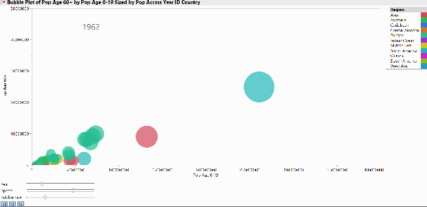
If you read the whole post and want to know how to make this fun bubble plot step-by-step with JMP, leave a comment!
Tip: To practice with data examples on your own, you can go to the navigation bar, select Help > Sample Data Library.
This instruction is very long, I know, but I am sure if you read the whole thing and follow the instruction, you will find it super useful when it comes to data analysis 🙂 If you use any other data analysis/statistical/visualization tools and you found them interesting, please share with me! I’d love to learn more things from you!

Great post! I really appreciate you going so in-depth! I really learned a lot and this will definitely help me out at work.
LikeLike
Thank you for your comment! I will e-mail you a step-by-step instruction for making the fun bubble ploy!
LikeLike
I really appreciate your work. It is very informative I’ve learned alot.
LikeLike